


Parrish in the Springtime
Posted on June 18, 2009 – 6:47 PM | by phildby Tim Foster
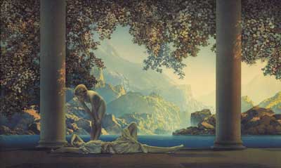
It is nearly impossible to explain the grip that Maxfield Parrish once held on the American imagination, but let’s start with the stats. Daybreak, the artist’s 1922 masterwork is believed to be the most-reproduced artwork in history, outstripping both Andy Warhol’s Soup Cans and Da Vinci’s Mona Lisa. The print was so popular in the twenties that it is believed that one in four American homes had a copy on display. In 1936 Time Magazine ranked Parrish as one of the three most popular artists in the world, surpassed only by Cezanne and van
Gogh. If he has not quite maintained that status, today Parrish is recognized, along with Norman Rockwell and Howard Pyle, as one of the three great American illustrators of the twentieth century. Fantasies and Fairy-Tales, Maxfield Parrish and the Art of the Print, the current show at the Crocker, explores Parrish’s best known but least examined role: the artist as communicator to the masses.
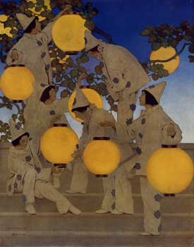
With nearly 100 works on display the exhibition spans most of the artist’s seventy-year career, which began in the 1890s. The early work, if less complex than the lush paintings which would become his signature, features a charming comic touch and showcases the daring use of composition and color that immediately put his competitors on notice. It is easy to see how Parrish became a top commercial artist; his numerous magazine covers and display ads (for clients as diverse as Fisk Auto Tires and Jello) are as engaging today as the day the artist created them.
The timing of Parrish’s entry into the field was fortuitous; lithographic color reproduction was the cutting edge technology of the day as Parrish began his career, and he, more than any other major artist of his era, embraced this new technology. A tinkerer by predilection, Parrish worked to understand the mechanics of industrial lithography, and combined that knowledge with an impeccable sense of design to become one of the preeminent colorists of his generation. ‘Parrish Blue’ is still spoken of- usually by people who have never seen a Parrish painting in person.
 There is plenty of ‘Parrish Blue’ on hand in the Crocker show, along with a surprising amount of ‘Parrish dark.’ I, like most, associate Parrish with blue skies and Golden Hour sun, so I didn’t expect to encounter so many dim scenes set just before daylight or just after sunset. Even some familiar prints like Stars (Parrish’s follow up to Daybreak), were darker than I had remembered. The darkness, of course, is the key to the supra-natural light in Parrish’s work; the dimness of the overall image makes the visible light- and the colors- seem that much brighter.
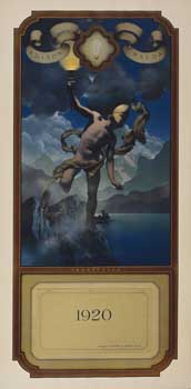
Parrish’s almost unnatural control of light was a source of comment among his contemporaries, to the point that he was once accused of having backlit a painting to achieve what seemed to some an uncanny glow. The truth was much simpler. Eschewing impasto and other ‘painterly’ techniques favored by most artists of his time, Parrish instead used a centuries-old manner of building color through the use of layers of transparent glazes of pigment. The technique is time consuming and requires extensive planning, but results in a light that truly comes from within the painting, as light reflects off the white base, through the layers of transparent color and then to the eye. The method also gave Parrish an advantage over his competitors as he prepared his paintings for print: lithography uses layers of colored inks in precisely the same manner, and a color proof set of Parrish’s 1933 Edison Mazda calendar offers a fascinating opportunity to see exactly how the process works.
 The exhibit also includes a rare complete run (1917 – 1933) of the Edison Mazda calendars, which are often seen in reproduction, but almost never encountered in the original. Parrish was justly famed for his calendars, first for Edison Mazda lamps, and later for Brown and Bigelow. The Edison Mazda calendars are exceptional, even for Parrish, and were the only advertising works he truly cared about according to his biographer, Alma Gilbert. Always featuring a central figure or small group against a dramatic background, each explored the theme of light in history and myth. Immensely popular in their time, the calendars are probably the best example of the artist seamlessly blending his commercial and fine art careers.
That mix of commercial and fine art sensibilities is the key to Parrish’s work. Though a tremendously talented painter, Parrish was an illustrator at heart. A painter needs only to create artwork that speaks to one viewer in one real space. An illustrator needs to create work that withstands (or, ideally, benefits from) the technological processes that create multiples to be experienced under vastly different conditions. Many great artists fail under these constraints and much artwork that is transcendent when experienced in person (Mark Rothko comes to mind here) falls flat in reproduction.
The best illustrators often create work that is better in reproduction than in the original, but Parrish was capable of making work that excelled in both forms. Comfortable in his niche between the fine and commercial worlds, Parrish saw no irony in using the latest mechanical processes to disseminate art that was resolutely anti-modern in both style and execution. If Parrish understood printing technology well enough to set the standard for color art reproductions, he understood his audience even better. His wistful imagery of the ideal captured the imagination of a generation, and continues to resonate today.
Fantasies and Fairy-Tales, Maxfield Parrish and the Art of the Print is on view Tuesdays through Sundays, 10AM – 5PM,
(1st & 3rd Thursdays until 9PM) through July 19, 2009, at the Crocker Art Museum, located at 216 O Street.